This came out of a 24-hour work sprint to replicate some sophisticated video VFX and to make it more flexible.
There’s a lot of pieces that go into an effect like this. What follows is an outline of the animations and VFX concepts, all in pure css :)
Core principles:
- Keep the text legible most of the time
- Don’t throw too many glitches in per second. Give it space to breathe
- Whitespace never hurt anyone
- Blurs & glows lend a feeling of realism in dark environments (queue neon)
Table of Contents
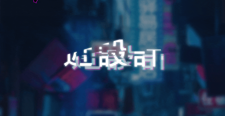
The Effect
This is how the complete effect looks like
The Effect (What we are going to make)
近設計
Layers
Create multiple layers to play with. For this example I’ll use ::before & ::after elements, but this could just as easily be multiple div’s overlapped, or whatever.
EXAMPLE
Example layers CSS:
| |
Paths
Build out a set of clip-paths (I wrote up a generator util for this project)
Example Path:
Over Text:
EXAMPLE
Example paths CSS:
| |
Movement
Create a stepping movement animation, so that the layers above can appear in different places as the other layers of the animation happen.
It’s best to make this timing somewhat erratic.
Example movement CSS:
| |
Opacity
Create a similar animation for opacity, so that the layers can appear/disappear. This will get layered with the movement to create the appearance of the layers popping in and out in different places.
There’s an art to getting this transition to work without making the user feel motion sickness. Take some time getting it right!
Example opacity CSS:
| |
Font
The next layer is changes to the font directly. These could be any properties, but we’ll stick to font-weight, blur and color.
EXAMPLE
Example font CSS:
| |
Combined Animation Layers
Note that some of the animations have sync’d timing, and some don’t.
I try to sync the paths & opacity animations, so that it looks like the background layers are really a part of the main text that’s glitching off.
Then I try to separately sync the color/text/filter other effects, and keep the movement separate completely. This gives the whole thing the appearance of a lot more effects than are actually happening, because of the different combinations.
EXAMPLE
Example CSS:
| |
Environment
For good measure, it should live in the right language & context :)
近設計
Example environment CSS:
| |
Example HTML layout:
Conclusion
With this walkthrough, you should now have a basic understanding of how to create glitch effects using pure CSS. By layering text, applying clip-paths, and animating movement, opacity, and font properties, you can achieve a striking cyberpunk-style effect. Experiment with these techniques to customize and enhance your web projects with a unique, futuristic flair. Dive in and start glitching!